Client Notes: "Concrete...serves a twofold purpose, being useful and beautiful at the same time. The homes and businesses of our customers act as the studios to showcase concrete artwork."
I loved this approach that concrete is artwork. It let me know that the logo should be thoughtful and that the client would appreciate something unique and not so literal.
Mood Board
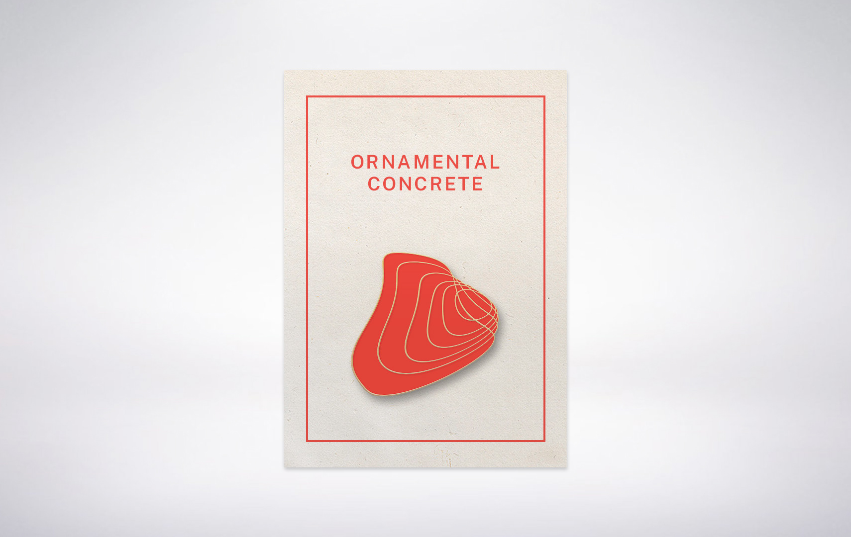
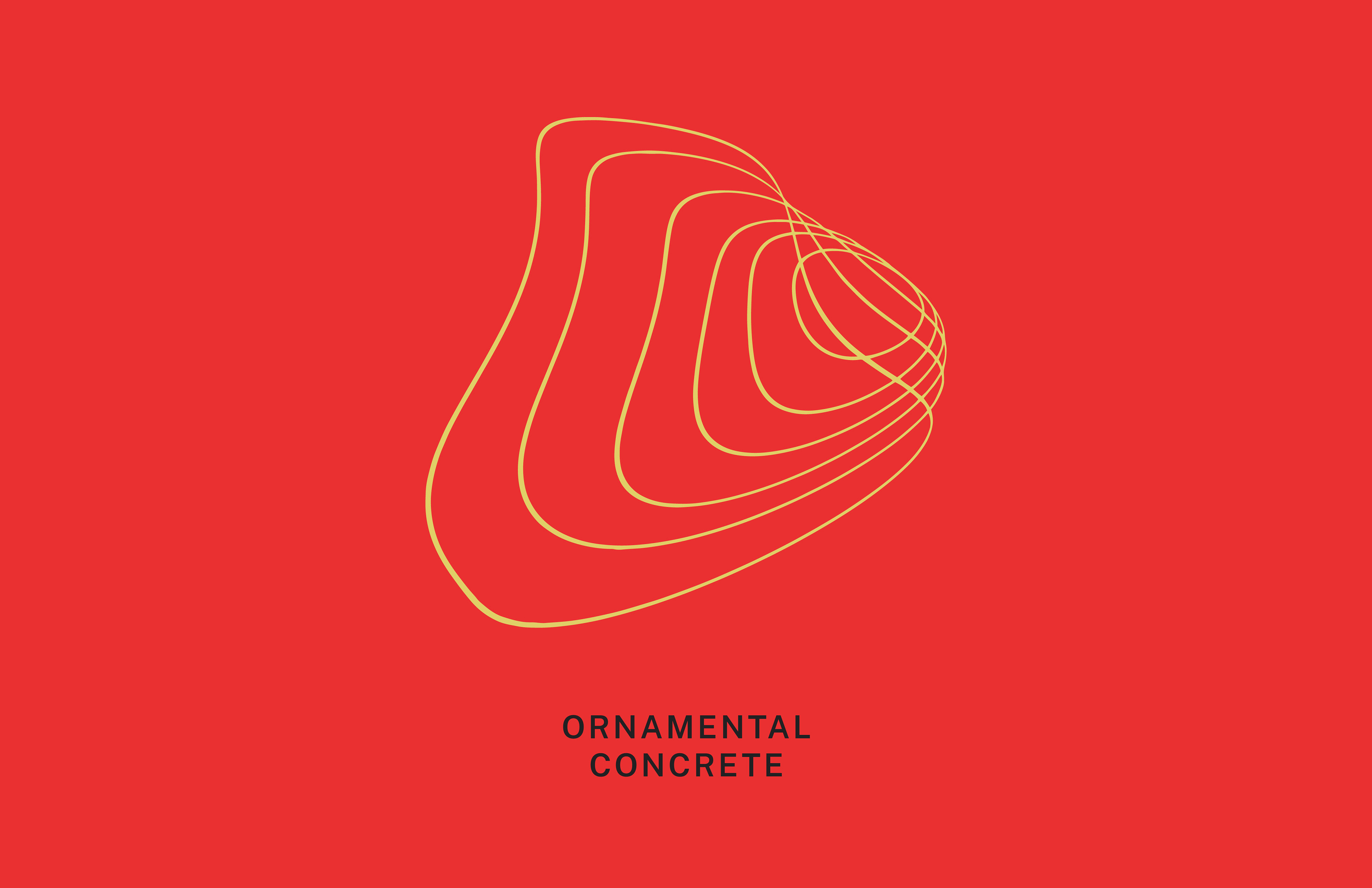
I ended up with an organic and structural mark. It has a boulder feel, strong but still fluid. I was inspired by the movement of pouring concrete and the ripples it makes. It also contains an "O" in the center and has a "C" shape that surrounds it.
Final Logo
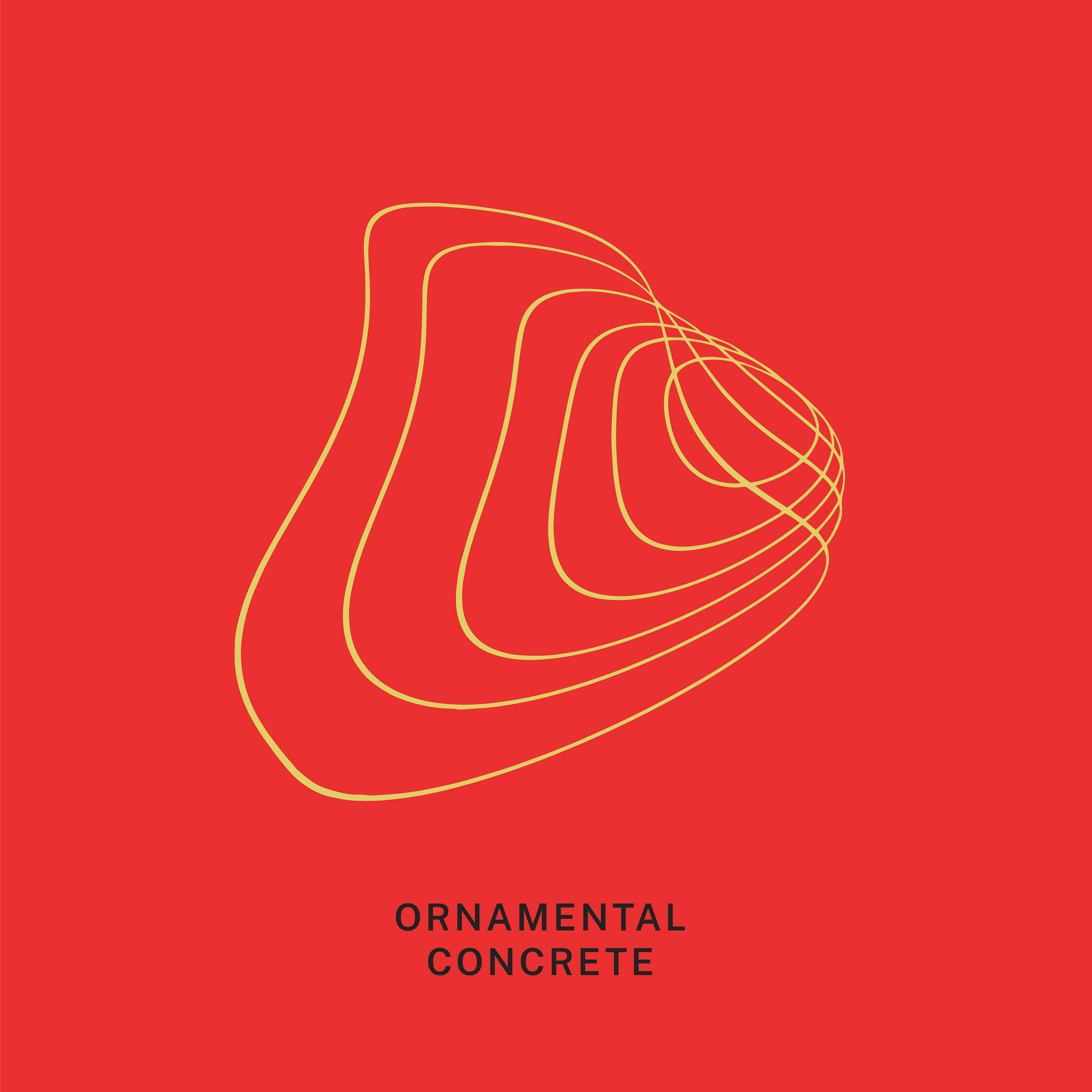
I also tried to keep elements from the original logo: the curves and the red and grey color scheme.
Before
After
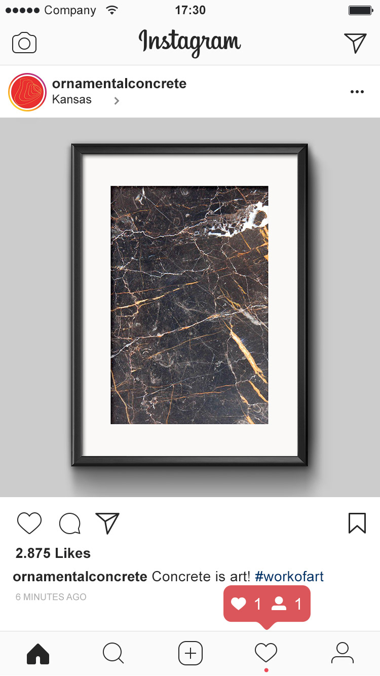
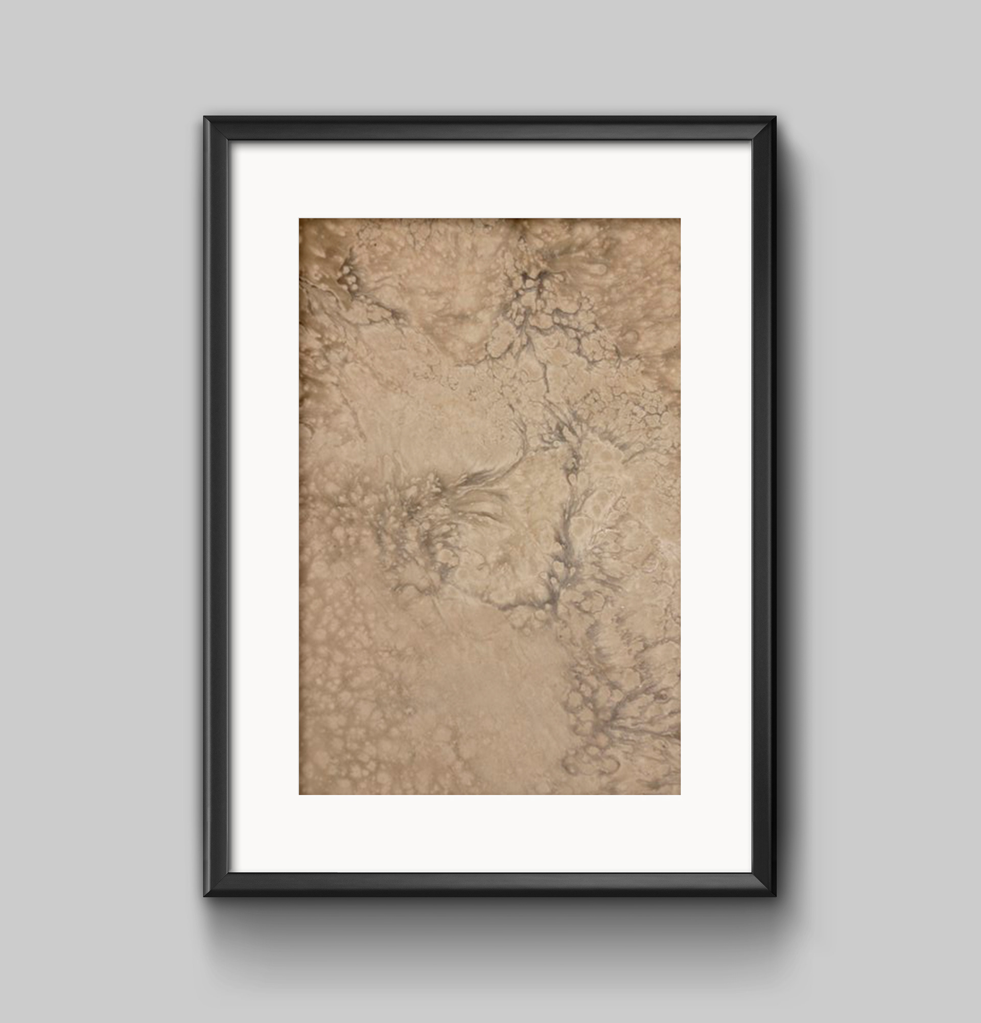
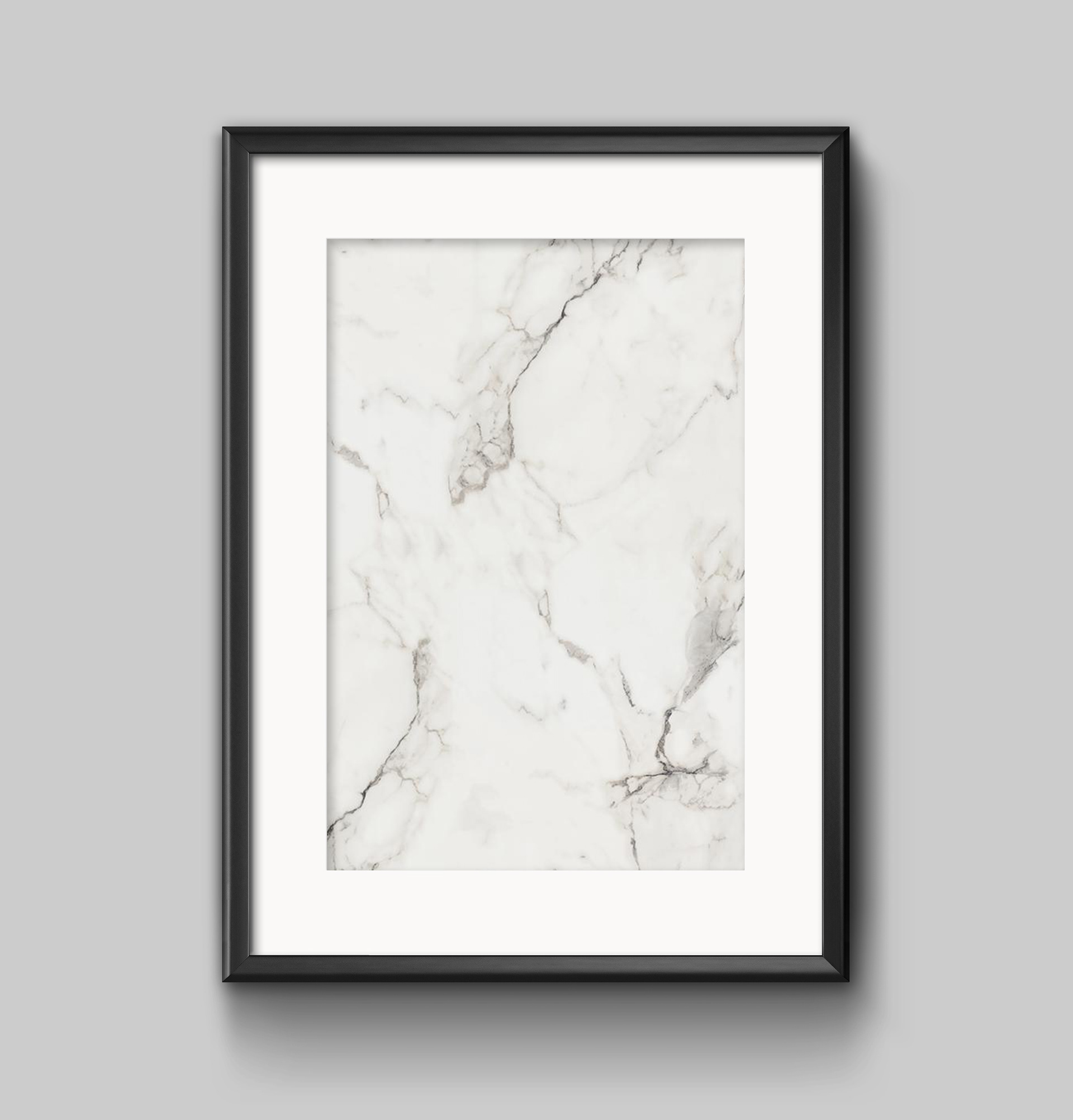
For a social campaign I thought it would be fun to frame concrete and treat it as if it were hanging in a museum.
See examples below.
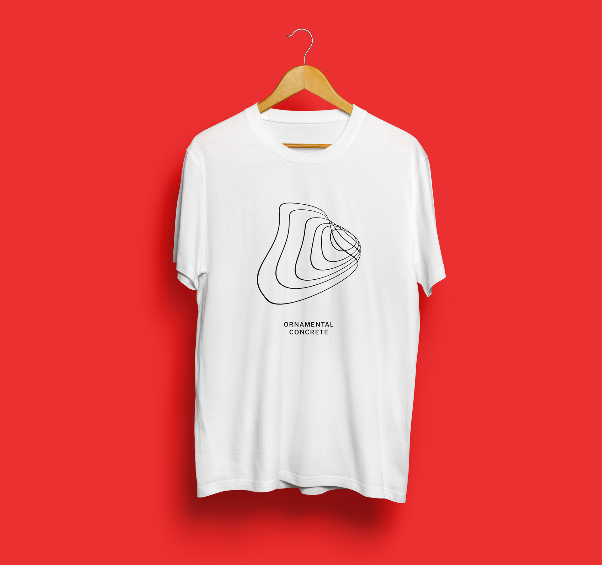
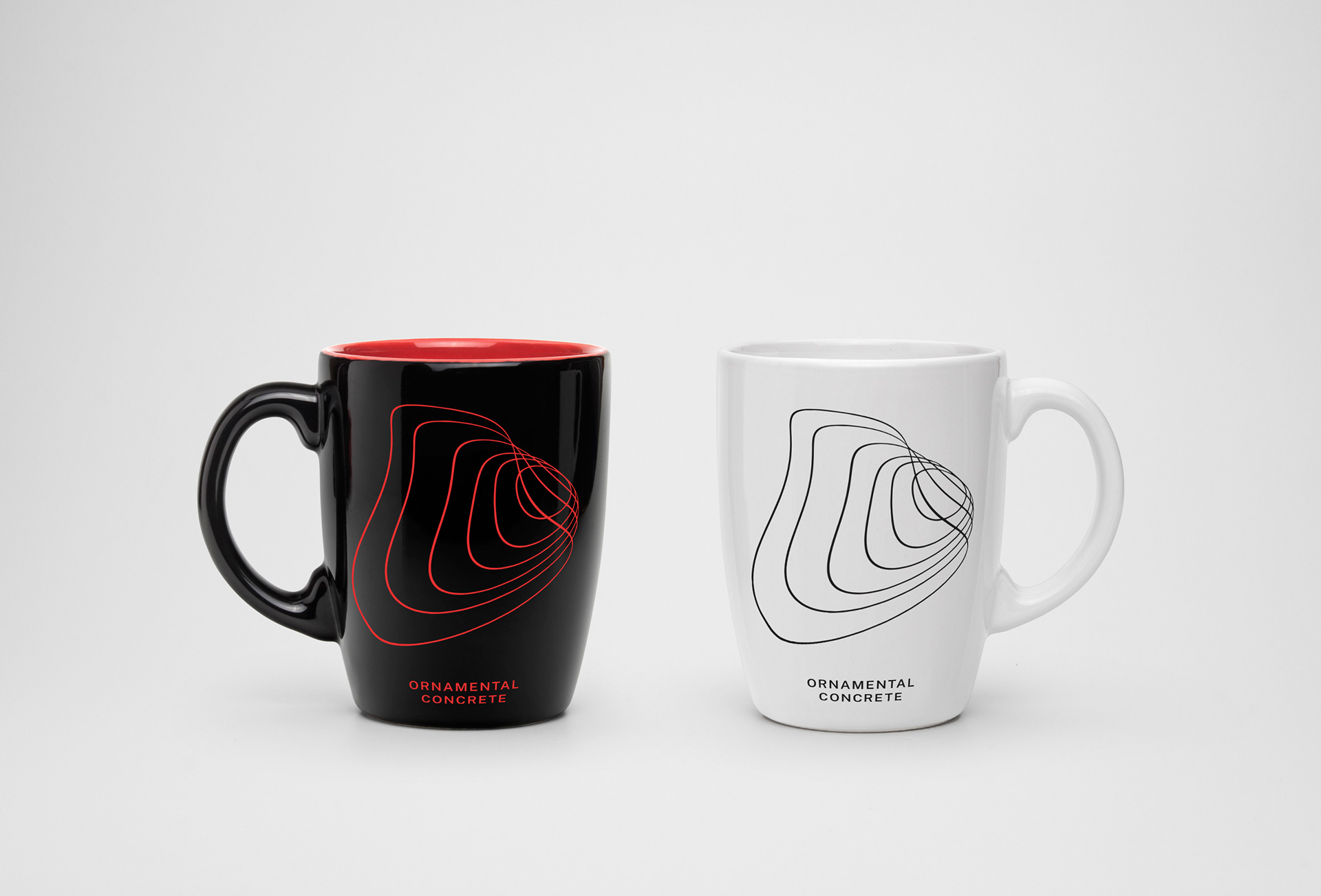
I had some fun coming up with other ways the branding can be executed.
See examples below